Linotype Mega Normal - typography
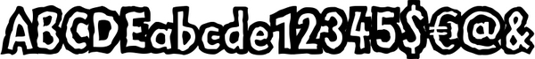

Linotype Mega is part of the Take Type Library, chosen from the entries of the Linotype-sponsored International Digital Type Design Contests of 1994 and 1997. The fun schrift of German designer Till F. Teenck is available in three weights whose names are word plays in themselves. "Mega in" (which we hope the font will be) contains relatively light, somewhat irregularly-drawn characters which look as though they were printed by hand and the characters are set rather far apart from each other. This weight is good for short and middle length texts in point sizes of 10 and larger. "Mega normal" is anything but. The characters are the outline forms of Mega in and their larger width reduces the distance between them. This weight is generally a headline font. "Mega out" is a very heavy weight and is the filled-in version of Mega normal. The characters flow into each other and look almost like silhouettes. The reduced legibility makes this font suitable exclusively for headlines in larger point sizes.
Right Owner: Linotype
Design year: 1997
Keywords: font;linotype mega;typography
File Size: 0 KBytes
| Embed: |
|
 font;linotype mega;typography
4529551
2.00
fonts-shop
Fresh Download
Available!
font;linotype mega;typography
4529551
2.00
fonts-shop
Fresh Download
Available!